
Salesforce is widely recognized as one of the market's leading customer relationship management (CRM) platforms. The platform provides companies and organizations with a robust suite of tools and products to manage customer data and interactions with them. Salesforce's capabilities range from marketing automation to sales forecasting, analytics, and customer service.
One key feature that makes Salesforce a leader in the CRM space is its emphasis on data-driven decision-making. The platform provides users with a vast array of reports that allow them to analyze customer data in real-time. By deriving insights from these reports (like customer behaviors, preferences, and interests) organizations can
- detect areas that need improvement;
- make stronger decisions regarding company growth;
- craft personalized marketing campaigns;
- enhance the customer experience;
- develop new products and services based on customer needs and feedback, etc.
Salesforce's reports are highly customizable: they allow users to drill down into specific data sets that reflect customer behavior, sales performance, and more. The platform’s reporting capabilities are cloud-based, so users can access their data from anywhere, anytime, making remote team collaboration easy.
Understanding Salesforce reporting
The four main types of reports in Salesforce are tabular, summary, matrix, and joined.
- Tabular Report: displays data in rows and columns, similar to a spreadsheet, generating a simple list of records. It is best suited for showing detailed information about each record, such as a contact or lead list.
- Summary Report: groups data in a way that summarizes information, such as displaying the total number of opportunities by stage or the average revenue by product. It can display subtotals, grouping headers, and grand totals, often including charts and graphs to better illustrate the summarized data.
- Matrix Report: provides a multi-dimensional view of data by allowing users to group data horizontally and vertically. It is useful for comparing data across multiple categories (defining the number of opportunities by stage and product). It allows the display of data in a table that can be further visualized using charts and graphs.
- Joined Report: allows users to combine data from multiple report types or sources into a single report. It is useful for analyzing related data that is stored in different objects or modules (sales data alongside customer service data). Users can view the data side-by-side or in separate sections within the same report.
An important question we must answer right now is how reports influence business strategies.
Reporting in Salesforce and other data-driven platforms provides insights into various business metrics - sales performance, customer behavior, operational efficiency, etc. By analyzing that data, businesses can gain a deeper understanding of their performance and identify areas that require improvement. For instance, Salesforce reports can help businesses track the success of their marketing campaigns and evaluate the effectiveness of their sales strategies. They can also provide valuable information about customer behavior, such as their buying habits and preferences.
A thorough analysis of all these data sets is priceless. It is the opportunity to get a comprehensive overview of company operation, where it slips, and what works best.
When businesses are armed with real-time solid stats, it’s up to them to decide where to invest resources and how to allocate budgets. If a report showcases a particular marketing as most effective, that is, with the highest ROI, companies can allocate more resources toward that campaign to maximize its impact.
Reports can help businesses identify gaps and deficiencies in their current strategies. Let’s take checkout, for instance: if a report proves customer charm rate rises during the checkout process, companies can address this issue by making the checkout less bumpy.
Prerequisites before creating a report
To create a report in Salesforce, make sure the necessary permissions and roles are in place. Depending on the type of report, you can choose from the Viewer, Editor, Manager, Compare, and Enhanced access levels to reports and dashboard folders. You can also grant access to reports and dashboards separately. A combination of user permissions determines the level of access to a report or dashboard folder. Administrators can more precisely control how users can access dashboards and reports by granting or revoking one or more rights.
Next, determine the type of report based on the objective. Ensure the data used in the report is valid and up-to-date. Otherwise, it can lead to inaccurate report results, which may hamper decision-making.
Lastly, it is essential to clearly understand the report's intended audience so that its presentation is most effective. If the report is intended for management, a summary report may fit better than the basic tabular one.
Step-by-step guide to create a basic report
Let’s figure out how to create a report in Salesforce.
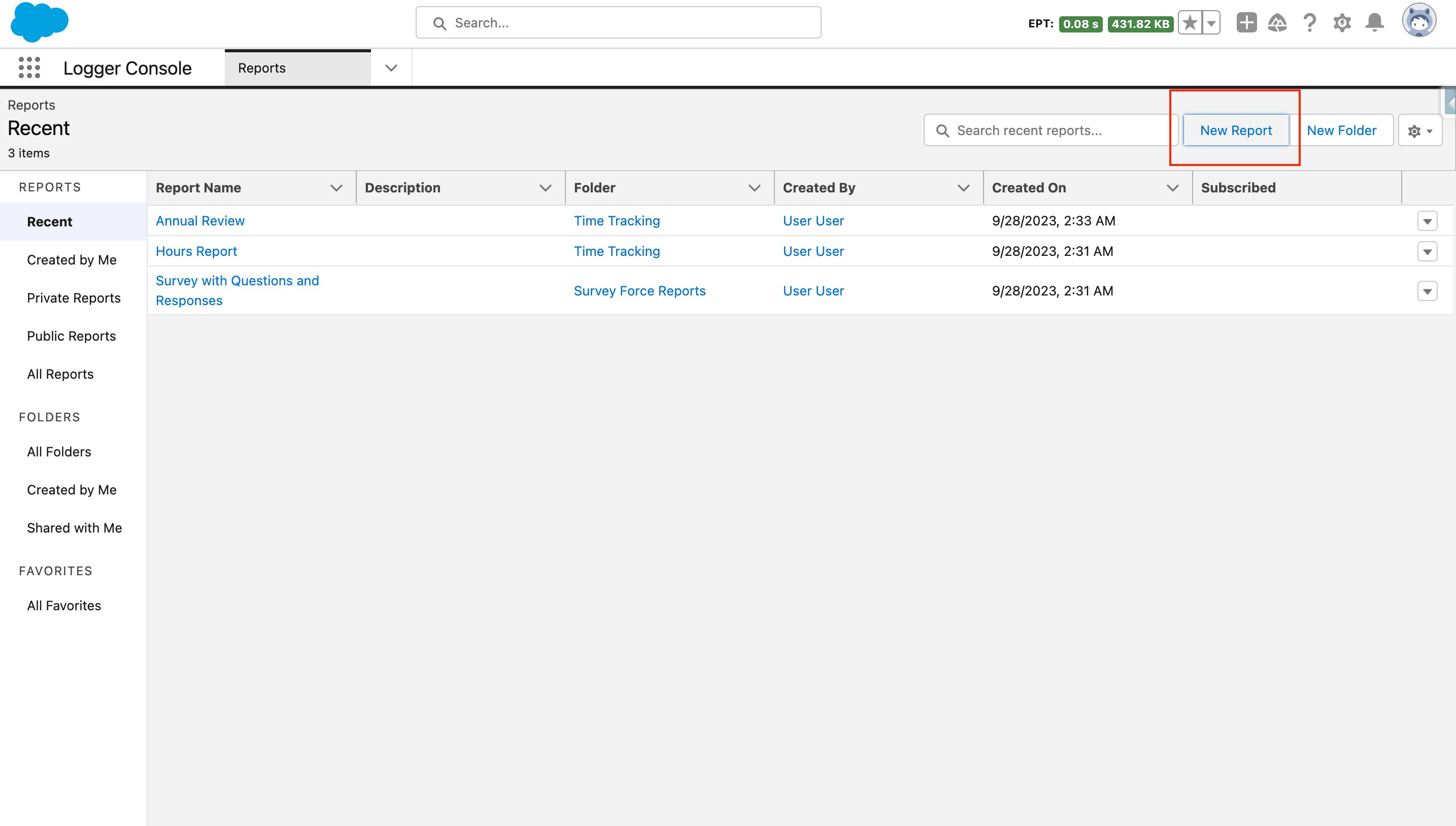
1. Navigate to the “Reports” tab at the top of the Salesforce homepage. Click the “New Report” button at the top of the page.
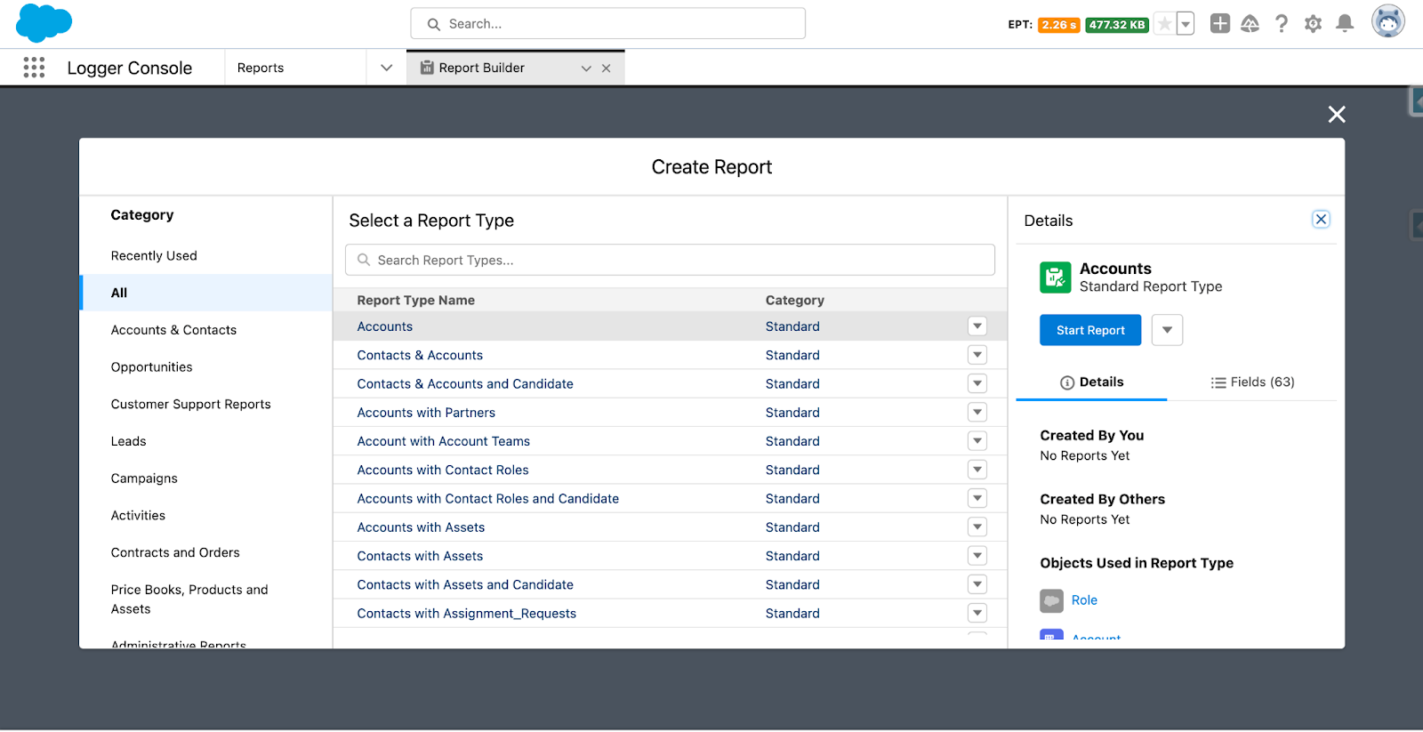
2. After clicking the “New Report” button, you will be prompted to select the report type from Opportunities, Leads, Accounts, Contacts, etc. Clicking on any report type's name brings up a side panel with more information, including the objects in that report type and the fields that can be used to display or filter it.
3. Once you have selected the report type, Salesforce forwards you to its canvas to apply filters (specific time periods, certain regions, etc.). Just tap on the “Filters” tab to get more granular with your data analysis. Turn on “Update Preview Automatically” to see the outcome.

4. With filters applied, add and organize the fields you want to include in your report: name, email, phone number, etc. Certain fields are pre-displayed in native reports. These can be deleted by selecting the "X" next to them, and you can add new fields by typing the field name into the search bar and choosing it. You can also group or reorder them using drag and drop and choose the view format.
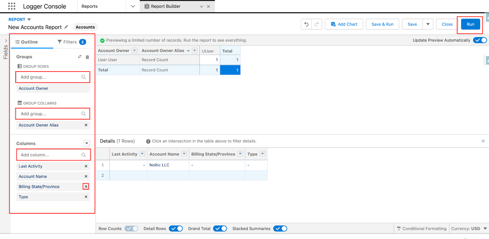
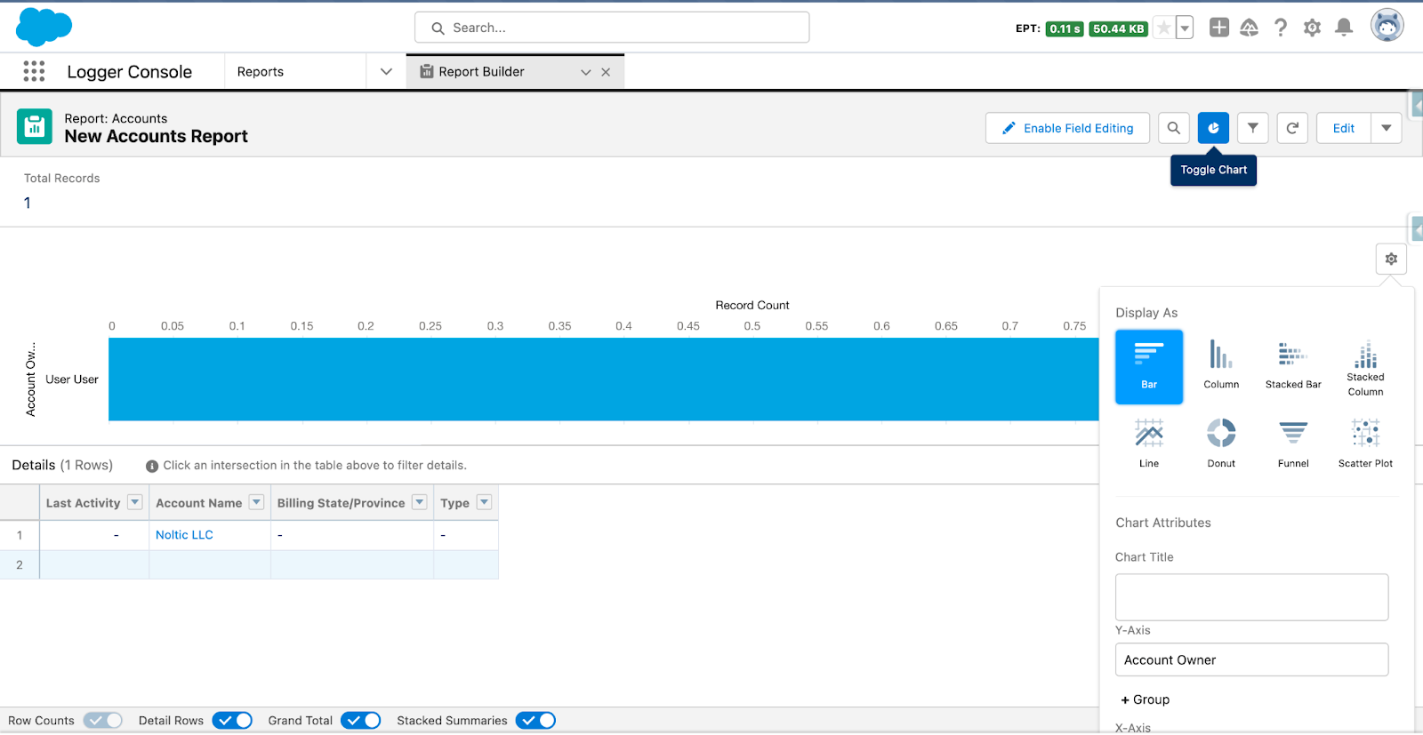
5. Hit “Refresh” to see the changes and click on the “Run” button to generate a visual representation of your data in the form of tables, charts, or graphs.
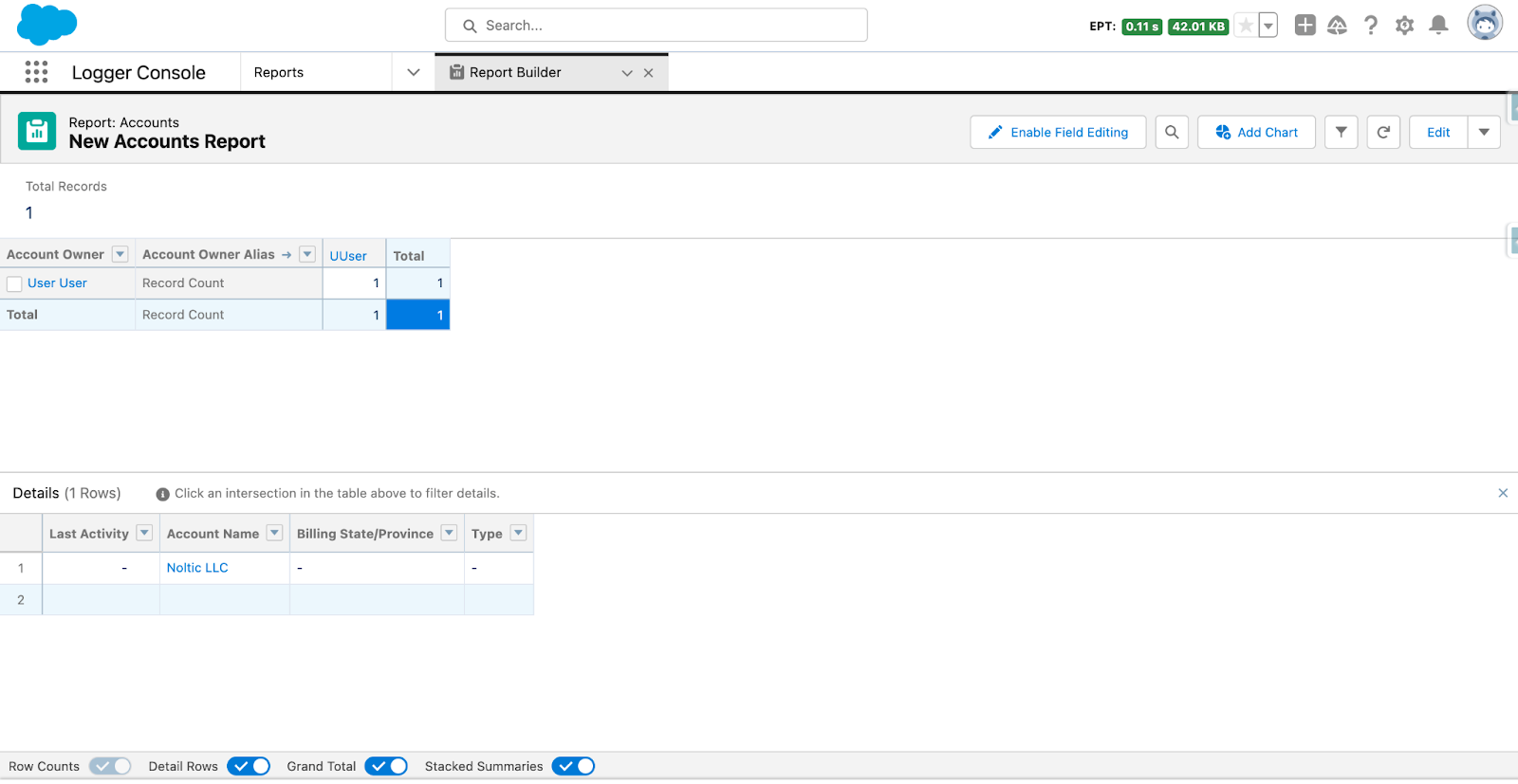
6. You can change the view of your report by clicking on the “Toggle Chart” button to see the data in a convenient format.
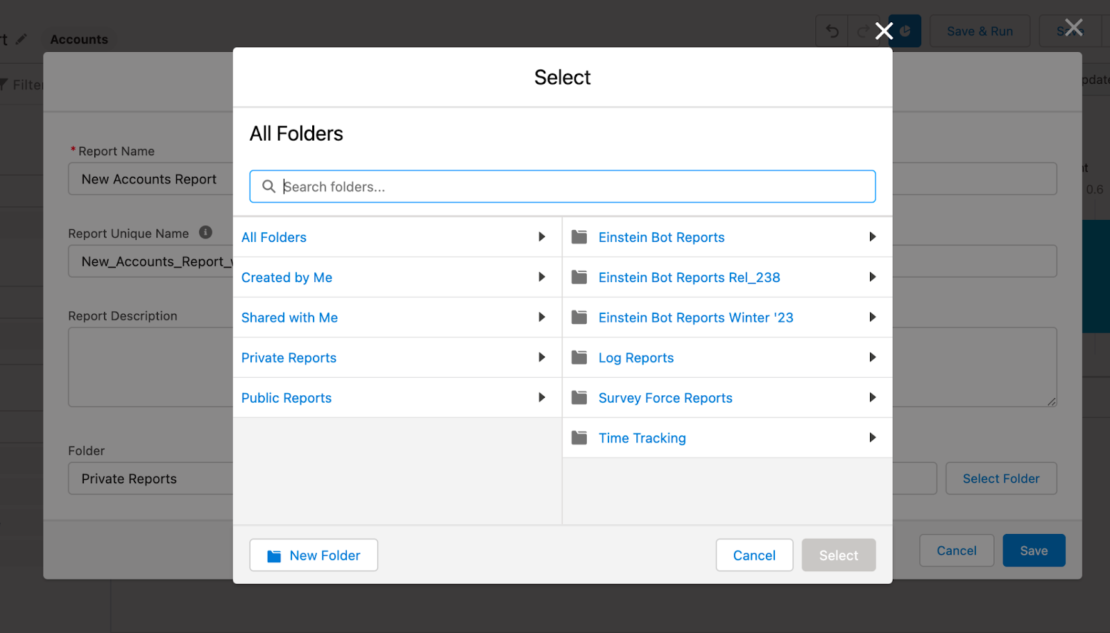
7. Give your report a descriptive and memorable name and save it in an easily accessible location. You can choose the visibility of the report, whether it is private or shared with specific users.
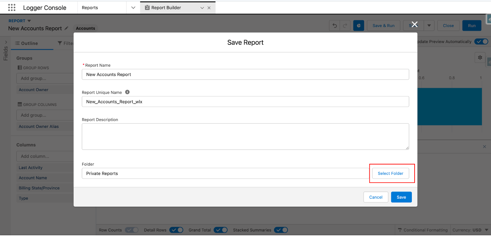
8. You can also add the report to a folder, queue it for refreshing, and schedule it to run at a specific time and frequency.
Customizing and enhancing the report
Built-in Salesforce reports don't necessarily fit each user's needs. That's where customizing and enhancing the report comes in handy. Drag-and-drop features, grouping data, incorporating charts and visuals, and conditional highlighting can help build the report you envision.
Let us guide you through the process.
- Rearrange columns via drag-and-drop: to use this feature, simply hover over the column header until the four-directional arrow appears. Then, drag the column to the desired location and release the mouse button. This feature can be especially helpful when you need to group similar data together or highlight important information.
- Group data for summary and matrix reports: this one helps summarize the information into a more manageable format. To group sales by region, product, or salesperson within the summary or matrix reports, simply drag the field you want to group by into the grouping pane, which is located to the left of the report.
- Incorporate charts and visuals: this is an excellent way to make a report more visually appealing. Salesforce offers several chart options, including bar charts, pie charts, line charts, and more. Click the “Add Chart” on the report builder toolbar and select the chart type. Configure its options, and it will now appear within your report.
- Highlighting important data: this feature allows you to format cells, rows, and columns based on specific criteria. To use conditional highlighting, select the column or cell you want to format and click “Highlight Rules” in the toolbar. Then, choose the criteria for formatting and the corresponding format.
Scheduling and sharing the report
Many companies struggle to keep stakeholders informed about the latest sales metrics or other important info, basically because they have to do it manually. Salesforce addressed this problem by offering automated report generation and sharing.
Set up automatic report runs
This is essential to run your reports regularly and keep your team in the know. To set up automatic report runs, follow these simple steps:
- Go to the report you want to schedule and click on the “Run Report” button.
- On the report view page, click on the “Schedule Report” button.
- Choose the frequency of the report run, whether it's daily, weekly, or monthly.
- Select the day and time you want the report to run.
- Save your selection.
Your report will run automatically on the chosen frequency, and your team will receive an email notification with the latest data.
Email the report to specific Salesforce users
If you want to share the latest report with specific users, you need to proceed as follows:
- Go to the report you want to share and click on the “Run Report” button.
- On the report view page, click on the “Email” button and select “Attach as PDF.”
- Enter the email addresses of the users with whom you want to share the report.
- Add a subject and message to the email if needed.
- Hit “Send” and you're done.
The report will be emailed as an attachment in PDF format to the specified users. They'll be able to access it without logging into Salesforce.
Understand report visibility and sharing settings
Lastly, decide on the report visibility and sharing settings to ensure accessibility to the required audience. Here's a quick overview:
- Private: Only the report owner and users with permission can view it.
- Public: All users in the organization can view the report, but they can't edit or delete it.
- Public with Subordinates: All users in the organization can view the report and its underlying records, but only the report owner and their subordinates can edit or delete it.
- Sharing: You can share a report with specific users, groups, roles, or territories.
To change your report's sharing settings, follow these steps:
- Go to the report you want to share and click the “Share” button.
- Choose the sharing option that suits your requirements.
- Add the users or groups with whom you want to share the report.
- Hit “Save” and you're done.
Common challenges and tips
While creating a report in Salesforce, you may encounter several common challenges. One of these is ensuring that the report criteria are accurate and relevant. This involves selecting the appropriate objects and fields, defining appropriate filters and grouping criteria. A similar issue may occur when determining the appropriate format and layout to present the data effectively. That is why you need to understand the target audience of your reports.
Another challenge is working with large datasets. Reports in Salesforce can often return a significant amount of data, and users may need to take steps to avoid hitting system limitations. This may include selecting appropriate report types or tuning report filters for maximum efficiency.
Ensuring data accuracy and completeness is also critical. The data source should be reliable and up-to-date, which can involve collaborating with other departments or teams to guarantee data is accurately entered into the system. Also, the report should present data in an easily understood and actionable way.
Finally, you may face challenges around report customization and data manipulation. Salesforce includes tools to modify or manipulate report data, including filters, grouping, and formula fields. However, it takes time to learn how to use these tools and their underlying data structure.
Leverage our tips for effective data representation:
- Before creating a report, establish a clear goal or objectives. What insights do you want to derive from the data? What questions do you want to answer? Ensure that your objectives are specific, measurable, achievable, relevant, and time-bound (SMART).
- Ensure that you choose the right report type that matches your objectives and the nature of the data you want to analyze.
- A clear and concise title helps you and your audience quickly understand the purpose and context of the report. Avoid using generic titles such as “Sales Report 1” and instead use more specific titles such as “Monthly Sales by Territory Report.”
- Organize data so that it's easy to understand and digest. Use meaningful headings and subheadings to group related data. Avoid cluttering the report with unnecessary data points or visualizations.
- Visualizations such as pie charts, bar charts, and line charts can help you quickly make sense of complex data. Use visuals to highlight trends, patterns, and relationships within the data. Use colors and labels judiciously to help users decipher the visualizations.
- Time periods are a critical aspect of many reports, especially those that track changes over time. Ensure that your report includes the appropriate time periods, such as monthly, quarterly, or yearly.
- Filters are a powerful way to customize reports by including or excluding data as needed. Use filters to highlight specific data relevant to specific stakeholders or objectives.
- Provide context for the data in your report, such as definitions, explanations, and references to external data sources. This can help users understand the data more comprehensively and critically.
Find out more about real-life data management application in the case study on our work for an Internet of Things company.


together